 Job Seeker:
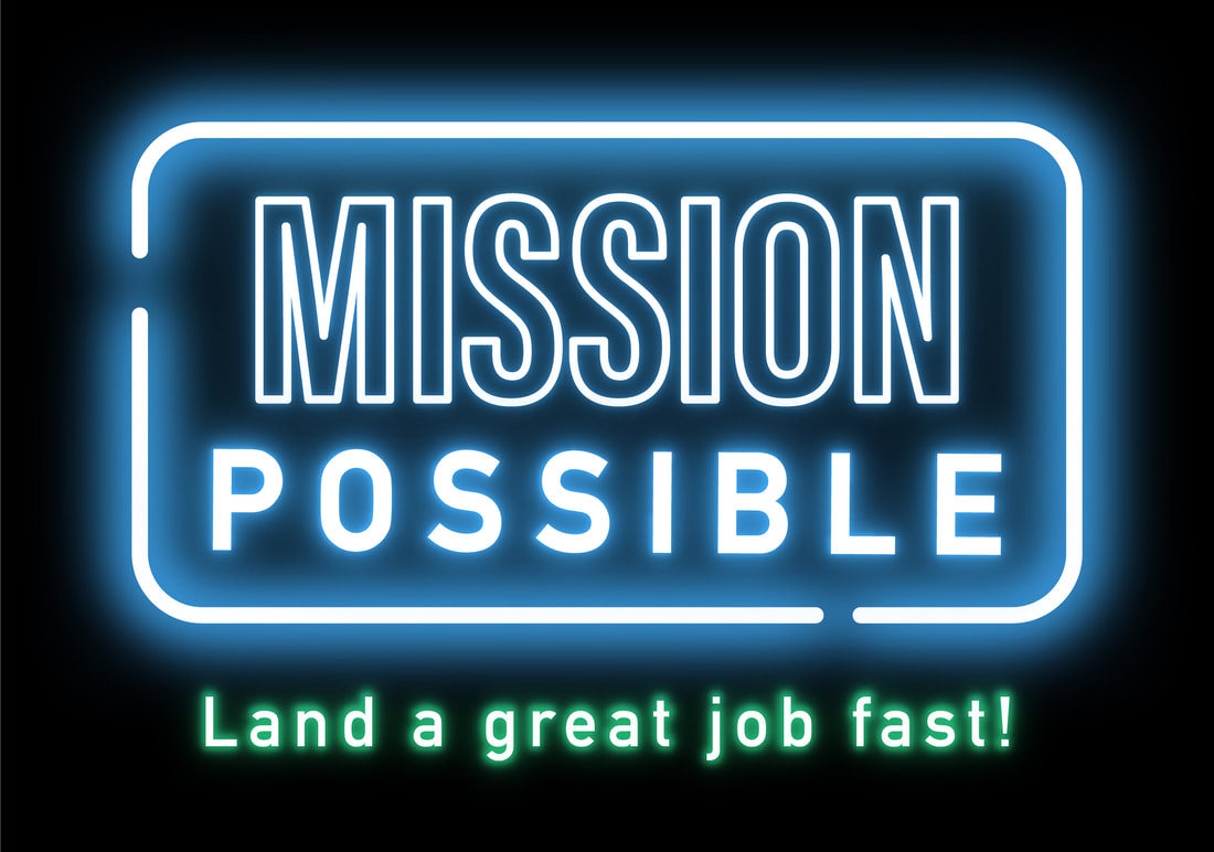
To carry out your mission to land a great job fast, you must provide a top-notch resume to your future employer. First impressions count. Design an attractive resume using classy fonts. There are two basic types of fonts: serif and sans- serif. Serif fonts have small lines trailing from the top-and-bottom edges of the letters. Serif fonts give an elegant, formal appearance. Some examples of serif fonts are: Bodoni Bookman Old Style Cambria Century Schoolbook Garamond Georgia Goudy Old Style Palatino Linotype Sans-serif fonts don’t have top-and-bottom lines on each character. Sans-serif fonts give a modern, minimalistic look. Some examples of sans-serif fonts are: Arial Narrow Calibri Century Gothic Futura Gill Sans Lucida Sans Tahoma Trebuchet Veranda Notice the difference in character height and width in the above-mentioned 12 pt. fonts. If you are having trouble squeezing text onto the page, consider changing typestyles. Avoid itty-bitty squint font. Choose a reasonable size font (10, 11, or 12 point for the body text and 12, 14, or 16 point for major headings). You will also notice that two fonts were intentionally left off the list: Arial and Times New Roman. Both are overused. Avoid them if you want your resume to stand out from the crowd. You can creatively blend serif and sans-serif fonts in your resume. For section headers, use sans-serif fonts; for the body text, use serif fonts, or vice versa. Be judicious; do not mix more than two type styles in one resume. Avoid script-like fonts. They are hard to read. Don't use creepy fonts (like Matisse ITC) or outlandish fonts (like Neurochrome). Your resume is not a playbill for a Broadway show. Your resume is not a love note. No frilly or flowery fonts. Keep it simple and professional. I share this advice with you because I like you and want you to succeed in your job search! Don’t cram text into margins less than.75 width on all sides. Keep healthy margins. Leave enough white space throughout the document for optimum visual appeal. And that’s the straight skinny on fonts. Be creative and professional in the design and layout of your resume. Job seeker, this concludes the mission briefing for today. Check back soon for more details of how to write a resume that will generate interviews and help you land a great job fast. © 2014 Sharla Taylor – All rights reserved.
2 Comments
Leave a Reply. |
Sharla Taylor's BlogCategories
All

Author
Sharla is a mulit-certified career coach, executive resume writer, job search strategist, networking consultant, and published author. Through her company, Written by a Pro, Sharla has been helping executives and mid-career professionals land great jobs with better compensation and work-life balance for more than 20 years. She approaches her business from a Christian perspective. Her favorite Scripture is Matthew 19:26 "with God all things are possible" and this Bible verse is the inspiration for the Mission Possible Career Coaching Program. Click here to explore some free resources for mid-career and executive job seekers and book your free, 20-minute consultation with Sharla Taylor. WRITTEN BY A PRO
912-656-6857 Mon. - Thurs. by appt. only Graphic Artist
Austin Farmer, graphic artist, is a graduate of Savannah College of Art and Design where he majored in Industrial Design and minored in Architecture. Austin creates marketing materials for businesses and uses his artistic and musical talents to enhance the worship service at Compassion Church. He also draws exquisite portraits and creates amazing animations! Austin's favorite Scripture passage is Isaiah 12:2. |
 RSS Feed